Defining templates
Templates are defined in template descriptor files as a JSON array:
[
  {
    "$schema": "https://unpkg.com/@camunda/zeebe-element-templates-json-schema/resources/schema.json",
    "name": "Template 1",
    "id": "sometemplate",
    "description": "some description",
    "keywords": [
      "search alias",
      "create action"
    ],
    "version": 1,
    "appliesTo": [
      "bpmn:Task"
    ],
    "elementType": {
      "value": "bpmn:ServiceTask"
    },
    "properties": [
      ...
    ]
  },
  {
    "name": "Template 2",
    ...
  }
]
As seen in the code snippet, a template consists of a number of important components:
$schema : String: URI pointing towards the JSON schema which defines the structure of the element template.jsonfile. Element template schemas are maintained in the element templates JSON schema repository. Following the JSON schema standard, you may use them for validation or to get assistance (e.g., auto-completion) when working with them in your favorite IDE.
The $schema attribute is required for Camunda 8 element templates.
Example:
"$schema": "https://unpkg.com/@camunda/zeebe-element-templates-json-schema/resources/schema.json"
name : String: Name of the template. Shown in the element template selection modal and in the properties panel (after applying an element template).id : String: ID of the template.description : String: Optional description of the template. Shown in the element template selection modal and in the properties panel (after applying an element template).keywords: Array<String>: Optional list of keywords. Can be used to help users find this template. Keywords are used for search and filtering but are not displayed in the UI.documentationRef : String: Optional URL pointing to a template documentation. Shown in the properties panel (after applying an element template).version : Integer: Optional version of the template. If you add a version to a template, it is considered unique based on its ID and version. Two templates can have the same ID if their version is different.appliesTo : Array<String>: List of BPMN types the template can be applied to.elementType : Object: Optional type of the element. If you configureelementTypeon a template, the element is replaced with the specified type when a user applies the template.properties : Array<Object>: List of properties of the template.
Creating and editing Connector templates
Connector templates are a specific kind of element template. You can edit them with visual preview and edit support like formatting, code completion, and error highlighting in Web Modeler.
JSON schema compatibility
The application uses the $schema property to ensure compatibility for a given element template. You find the latest supported versions here.
The tooling ignores element templates defining a higher $schema version and logs a warning message.
For example, given the following $schema definition, the application takes 0.9.1 as the JSON schema version of the element template:
"$schema": "https://unpkg.com/@camunda/zeebe-element-templates-json-schema@0.9.1/resources/schema.json"
The JSON schema versioning is backward-compatible, meaning that all versions including or below the current one are supported.
Supported BPMN types
Currently, element templates may be used on the following BPMN elements:
bpmn:Activity(including tasks, service tasks, and others)bpmn:SequenceFlow(for maintainingcondition)bpmn:Processbpmn:Event
Defining template properties
With each template, you define some user-editable fields as well as their mapping to BPMN 2.0 XML, and Camunda extension elements.
Let us consider the following example that defines a template for a mail sending task:
{
  "$schema": "https://unpkg.com/@camunda/zeebe-element-templates-json-schema/resources/schema.json",
  "name": "REST Connector",
  "id": "io.camunda.examples.RestConnector",
  "description": "A REST API invocation task.",
  "appliesTo": ["bpmn:ServiceTask"],
  "properties": [
    {
      "type": "Hidden",
      "value": "http",
      "binding": {
        "type": "zeebe:taskDefinition",
        "property": "type"
      }
    },
    {
      "label": "REST Endpoint URL",
      "description": "Specify the url of the REST API to talk to.",
      "type": "String",
      "binding": {
        "type": "zeebe:taskHeader",
        "key": "url"
      },
      "constraints": {
        "notEmpty": true,
        "pattern": {
          "value": "^https?://.*",
          "message": "Must be http(s) URL."
        }
      }
    },
    {
      "label": "REST Method",
      "description": "Specify the HTTP method to use.",
      "type": "Dropdown",
      "value": "get",
      "choices": [
        { "name": "GET", "value": "get" },
        { "name": "POST", "value": "post" },
        { "name": "PATCH", "value": "patch" },
        { "name": "DELETE", "value": "delete" }
      ],
      "binding": {
        "type": "zeebe:taskHeader",
        "key": "method"
      }
    },
    {
      "label": "Request Body",
      "description": "Data to send to the endpoint.",
      "value": "",
      "type": "String",
      "optional": true,
      "binding": {
        "type": "zeebe:input",
        "name": "body"
      }
    },
    {
      "label": "Result Variable",
      "description": "Name of variable to store the response data in.",
      "value": "response",
      "type": "String",
      "optional": true,
      "binding": {
        "type": "zeebe:output",
        "source": "= body"
      }
    }
  ]
}
The example defines five custom fields, each mapped to different technical properties:
- The task type
httpis mapped to thetypeproperty of azeebe:taskDefinitionelement in BPMN 2.0 XML. - The
REST Endpoint URLandREST Methodare mapped totask headers. - The
Request Bodyis mapped to a local variable via aninput parameter. - The
Result Variableis mapped into a process variable via anoutput parameter.
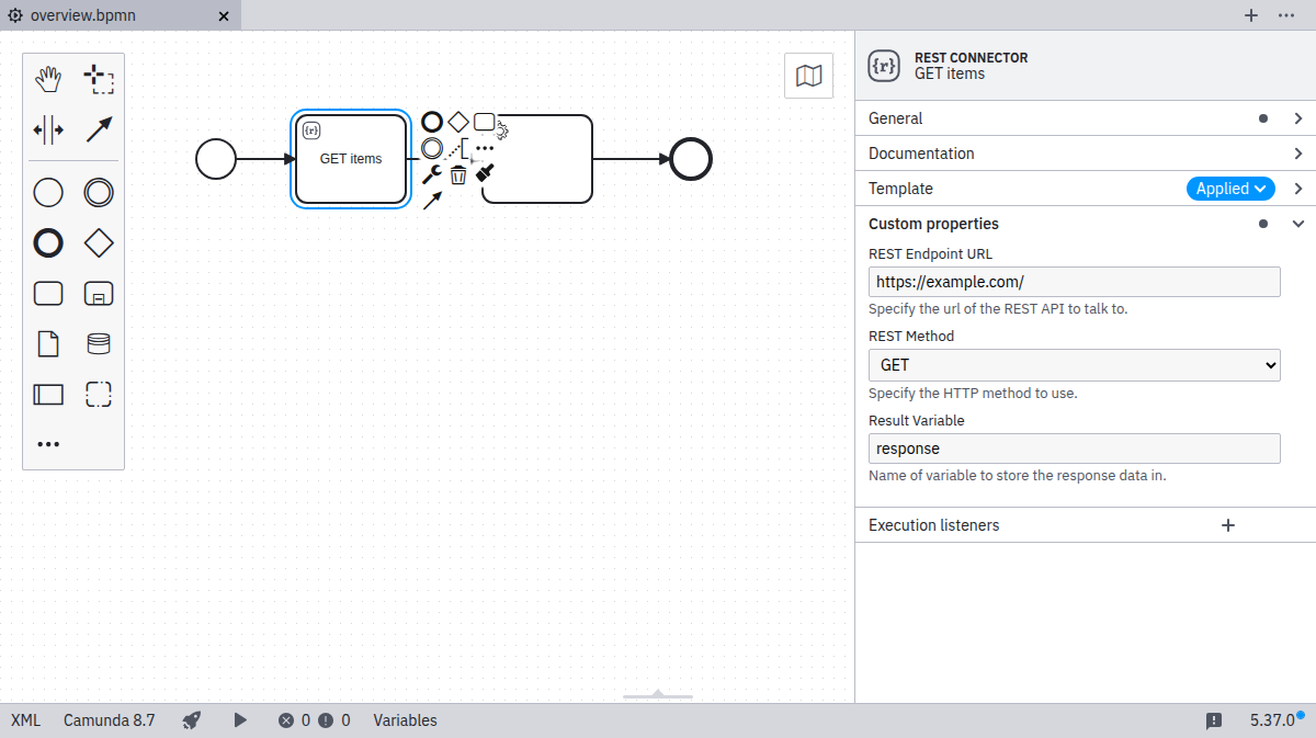
The task type is hidden to the user. Properties specified in the template can be edited through the properties panel as shown in the following screenshot:

As seen in the example, the important attributes in a property definition are:
label: A descriptive text shown with the property.type: Defining the visual appearance in the properties panel (may be any ofString,Text,Boolean,DropdownorHidden).value: An optional default value to be used if the property to be bound is not yet set.binding: Specifying how the property is mapped to BPMN or Camunda extensions (cf. bindings).constraints: A list of editing constraints to apply to the template.
In addition, fields can be activated conditionally via these properties:
id: An identifier that can be used to reference the property in conditional propertiescondition: A condition that determines when the property is active
Generated value
As an alternative to static value, you can use a generated value. The value is generated when a property is applied to an element. Currently, the generated value can be a UUID:
{
  "type": "Hidden",
  "generatedValue": {
    "type": "uuid"
  },
  "binding": {
    "type": "zeebe:property",
    "name": "id"
  }
}
Types
The input types String, Text, Boolean, Dropdown, and Hidden are available. As seen above String maps to a single-line input, while Text maps to a multi-line input.
Boolean / checkbox type
The Boolean type maps to a checkbox that can be toggled by the user.
When checked, it maps to true in the respective field (refer to bindings).
Dropdown type
The Dropdown type allows users to select from a number of pre-defined options that are stored in a custom properties choices attribute as { name, value } pairs:
...
  "properties": [
    ...
    {
      "label": "REST Method",
      "description": "Specify the HTTP method to use.",
      "type": "Dropdown",
      "value": "get",
      "choices": [
        { "name": "GET", "value": "get" },
        { "name": "POST", "value": "post" },
        { "name": "PATCH", "value": "patch" },
        { "name": "DELETE", "value": "delete" }
      ],
      "binding": {
        "type": "zeebe:taskHeader",
        "key": "method"
      }
    }
  ]
...
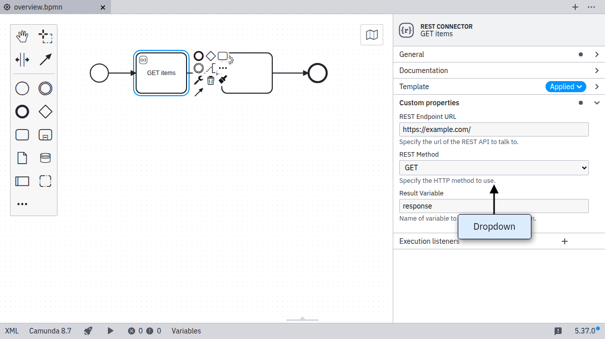
The resulting properties panel control looks like this:

FEEL
We support the feel properties optional and required.
When set, the input field offers visual indications that a FEEL expression is expected.
  "properties": [
    {
      "label": "Optional FEEL Expression",
      "type": "String",
      "feel": "optional"
    },
    {
      "label": "Required FEEL Expression",
      "type": "Text",
      "feel": "required"
    }
  ]
Supported types
The property feel is supported on the following input types:
StringText
Bindings
The following ways exist to map a custom field to the underlying BPMN 2.0 XML. The mapping result in the following section uses [userInput] to indicate where the input provided by the user in the Properties Panel is set in the BPMN XML. As default or if no user input was given, the value specified in value is displayed and used for [userInput]. [] brackets are used to indicate where the parameters are mapped to in the XML.
Notice that adherence to the following configuration options is enforced by design. If not adhering, it logs a validation error and ignores the respective element template.
property
Binding type | property |
|---|---|
Valid property type's | All property types are supported |
| Binding parameters | name: The name of the property |
| Mapping result | <... [name]=[userInput] ... /> |
Configures a generic BPMN element property.
zeebe:input
Binding type | zeebe:input |
|---|---|
Valid property type's | StringTextHiddenDropdown |
| Binding parameters | name: The name of the input parameter |
| Mapping result | <zeebe:input target="[name]" source="[userInput] /> |
Configures an input mapping.
zeebe:output
Binding type | zeebe:output |
|---|---|
Valid property type's | StringTextHiddenDropdown |
| Binding parameters | source: The source of the output parameter |
| Mapping result | <zeebe:output target="[userInput]" source="[source] /> |
Configures an output mapping.
zeebe:taskHeader
Binding type | zeebe:taskHeader |
|---|---|
Valid property type's | StringTextHiddenDropdown |
| Binding parameters | key: The key of the task header |
| Mapping result | <zeebe:header key="[key]" value="[userInput] /> |
Configures a task header.
zeebe:taskDefinition
Binding type | zeebe:taskDefinition |
|---|---|
Valid property type's | StringTextHiddenDropdown |
| Binding parameters | property: The name of the task definition property. Can be type or retries. |
| Mapping result | <zeebe:taskDefinition [property]="[userInput]" /> |
Configures the task for a service or user task.
zeebe:taskDefinition:type
zeebe:taskDefinition:type is a deprecated binding. Instead, use zeebe:taskDefinition with property=type.
Binding type | zeebe:taskDefinition:type |
|---|---|
Valid property type's | StringTextHiddenDropdown |
| Binding parameters | |
| Mapping result | <zeebe:taskDefinition type="[userInput]" /> |
Configures the task type for a service or user task.
zeebe:property
Binding type | zeebe:property |
|---|---|
Valid property type's | StringTextHiddenDropdown |
| Binding parameters | name: The name of the property |
| Mapping result | <zeebe:property name="[name]" value="[userInput] /> |
The zeebe:property binding allows you to set any arbitrary property for an outside system. It does not impact execution of the Zeebe engine.
bpmn:Message#property
Binding type | bpmn:Message#property |
|---|---|
Valid property type's | StringTextHiddenDropdown |
| Binding parameters | name: The name of the property |
| Mapping result | <bpmn:message [name]="[userInput]" /> |
The bpmn:Message#property binding allows you to set properties of a bpmn:Message referred to by the templated element. This binding is only valid for templates of events with bpmn:MessageEventDefinition, receive tasks, and send tasks.
bpmn:Message#zeebe:subscription#property
Binding type | bpmn:Message#property |
|---|---|
Valid property type's | StringTextHiddenDropdown |
| Binding parameters | name: The name of the property |
| Mapping result | <zeebe:subscription [name]="[userInput]" /> |
The bpmn:Message#zeebe:subscription#property binding allows you to set properties of a zeebe:subscription set within bpmn:Message referred to by the templated element. This binding is only valid for templates of events with bpmn:MessageEventDefinition, and receive tasks.
The binding name of correlationKey is not applicable to message start events on a process. In such cases, the property is automatically hidden.
zeebe:calledElement
Binding type | zeebe:calledElement |
|---|---|
Valid property type's | StringTextHiddenDropdown |
| Binding parameters | property: The name of the property (only processId is supported) |
| Mapping result | <zeebe:calledElement [property]="[userInput]" /> |
The zeebe:calledElement binding allows you to configure process called by a call activity.
For zeebe:calledElement bindings, variable propagation is not supported. To provide or retrieve variables, use zeebe:input and zeebe:output bindings.
Optional bindings
We support optional bindings that do not persist empty values in the underlying BPMN 2.0 XML.
If a user removes the value in the configured control, it will also remove the mapped element.
[
  {
    "$schema": "https://unpkg.com/@camunda/zeebe-element-templates-json-schema/resources/schema.json",
    "name": "Task example",
    "id": "some-template",
    "appliesTo": ["bpmn:ServiceTask"],
    "properties": [
      {
        "label": "Request",
        "type": "String",
        "optional": true,
        "binding": {
          "type": "zeebe:input",
          "name": "request"
        }
      },
      {
        "label": "Response",
        "type": "Text",
        "optional": true,
        "binding": {
          "type": "zeebe:output",
          "source": "response"
        }
      }
    ]
  }
]
Supported Bindings
The following binding types can be optional:
zeebe:inputzeebe:outputzeebe:taskHeaderzeebe:property
Groups
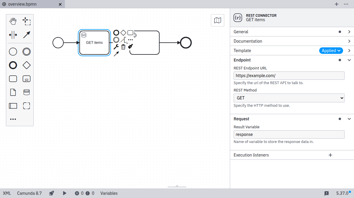
You can define groups to organize custom fields into:
{
  "$schema": "https://unpkg.com/@camunda/zeebe-element-templates-json-schema/resources/schema.json",
  "name": "Groups",
  "id": "group-example",
  "appliesTo": [
    "bpmn:ServiceTask"
  ],
  "groups": [
    {
      "id": "definition",
      "label": "Task definition",
      "openByDefault": true
    },
    {
      "id": "request",
      "label": "Request payload"
    },
    {
      "id": "result",
      "label": "Result mapping"
    },
    {
      "id": "authentication",
      "label": "Authentication",
      "tooltip": "Optional authentication settings"
    }
  ],
  "properties": [
    ...
  ]
}
Groups can have the following attributes:
id: Unique identifier of the grouplabel: Label of the grouptooltip: Tooltip for the group (optional)openByDefault: Whether the group will be expanded in the properties panel (optional, default:false)
Associate a field with a group (ID) via the fields group key:
{
  ...
  "properties": [
    {
      "group": "definition",
      "label": "Task type",
      "type": "String",
      "value": "http",
      "binding": {
        "type": "zeebe:taskDefinition:type"
      }
    },
    ...
  ],
  ...
}

Constraints
Custom fields may have a number of constraints associated with them:
notEmpty: Input must be non-emptyminLength: Minimal length for the inputmaxLength: Maximal length for the inputpattern: Regular expression to match the input against
Regular expression
Together with the pattern constraint, you can define your custom error messages:
...
  "properties": [
    {
      "label": "Web service URL",
      "type": "String",
      "binding": { ... },
      "constraints": {
        "notEmpty": true,
        "pattern": {
          "value": "https://.*",
          "message": "Must be https URL"
        }
      }
    }
  ]
Placeholder
The following property types support the placeholder attribute:
StringText
The placeholder is displayed when a field is empty:
...
  "properties": [
    {
      "label": "Web service URL",
      "type": "String",
      "binding": { ... },
      "placeholder": "https://example.com"
    }
  ]
Icons
It is possible to define custom icons to update the visual appearance of elements after applying an element template.
[
  {
    "name": "Template 1",
    "id": "sometemplate",
    "appliesTo": [
      "bpmn:ServiceTask"
    ],
    "icon": {
      "contents": "data:image/svg+xml,%3Csvg xmlns='http://www.w3.org/2000/svg' width='22' height='22' viewBox='0 0 22 22' fill='none'%3E%3Ccircle cx='11' cy='11' r='9' fill='black'/%3E%3Ctext x='6.9' y='14.9' fill='white' style='font-family: Arial; font-size: 10px;'%3EM%3C/text%3E%3C/svg%3E"
    },
    "properties": [
      ...
    ]
  }
]
![]()
The icon contents must be a valid data or HTTP(s) URL. We recommend using square icons as they get rendered 18x18 pixels on the canvas and 32x32 pixels in the properties panel.
Display all entries
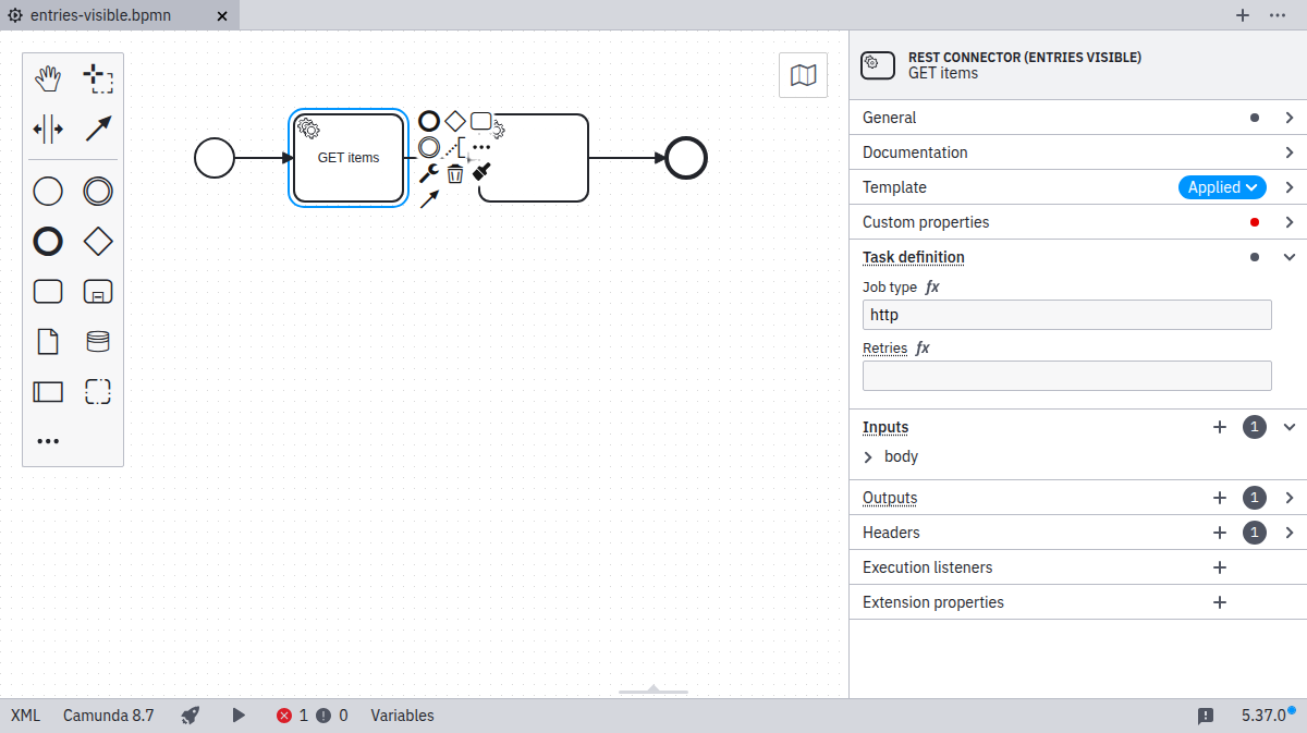
Per default, the element template defines the visible entries of the properties panel. All other property controls are hidden. If you want to bring all the default entries back, it is possible to use the entriesVisible property.
[
  {
    "name": "Template 1",
    "id": "sometemplate",
    "entriesVisible": true,
    "appliesTo": [
      "bpmn:ServiceTask"
    ],
    "properties": [
      ...
    ]
  }
]

Defining conditional properties
Properties may have a condition which determines when they should be active, depending on the value of another property. When property is active, it is displayed in the properties panel, and its value is serialized in the XML. If a property is not active, it is not displayed, and its value is removed from the XML.
For a property value to be used in a condition, the property needs to have an id that can be referenced by the conditional property.
A property can depend on one or more conditions. If there are multiple conditions, they can be defined using allMatch. All of the conditions must be met for the property to be active.
There are three possible comparison operators:
equals: Checks if the value is equal to the value defined in the condition.oneOf: Checks if the value is in the list of values defined in the condition.isActive: Checks if the referenced property is currently active and not hidden by other conditions.
...
  "properties": [
    {
      "id": "httpMethod",
      "label": "HTTP Method",
      "type": "Dropdown",
      "choices": [
        { "name": "get", "value": "GET" },
        { "name": "patch", "value": "PATCH" },
        { "name": "post", "value": "POST" },
        { "name": "delete", "value": "DELETE" }
      ],
      "binding": { ... },
    },
    {
      "label": "Request Body",
      "type": "String",
      "binding": { ... },
      "condition": {
        "property": "httpMethod",
        "oneOf": ["patch", "post", "delete"]
      }
    },
    {
      "id": "authenticationType",
      "label": "Authentication Type",
      "type": "Dropdown",
      "choices": [
        {
          "name": "None",
          "value": ""
        },
        {
          "name": "Basic",
          "value": "basic"
        }
      ],
      "binding": { ... }
    },
    {
      "label": "Username",
      "type": "String",
      "binding": { ... },
      "condition": {
       "allMatch": [
          {
            "property": "httpMethod",
            "oneOf": ["patch", "post", "delete"]
          },
          {
            "property": "authenticationType",
            "equals": "basic"
          }
        ]
      }
    },
    {
      "label": "Password",
      "type": "String",
      "binding": { ... },
      "condition": {
        "allMatch": [
          {
            "property": "httpMethod",
            "oneOf": ["patch", "post", "delete"]
          },
          {
            "property": "authenticationType",
            "equals": "basic"
          }
        ]
      }
    },
  ]